Non-Profit Redesign:
Books for Keeps
Details:
Role: UX/UI Designer, Interviewer, Researcher
Duration: 3 weeks
Team Style: team of four
Tools: Adobe XD, Figma, Miro
Project Overview:
Books for Keeps, a non-profit that gives books to kids who might otherwise have none, needed an updated website that reflected the organization’s success in the community and rapid expansion.
We were tasked with creating a responsive website that shared the Books for Keeps story in a way that hooked community stakeholders, encouraged involvement and generated donations.
Research
Interviews:
We interviewed four individuals who have previously donated to a non-profit organization. I also conducted an interview with the Books for Keeps Executive Director, Leslie Hale.
We asked the four individuals questions about:
Their volunteer life
Donation style/methods
I asked the Books for Keeps stakeholder questions about:
Feelings towards current website
Pain points or aspects the organization would like to change on website
Insights
Responsive
The current website is not mobile friendly
and lacks solid
content organization.
Credible
Highlighting the mission is crucial to establish Books for Keep’s credibility.
Simple
The donation process needs to be simple and include a donation frequency option.
User Persona
Definition & Synthesis
Problem Statement:
BooksforKeeps.org was created to communicate their mission in order to foster relationships, encourage volunteerism and collect donations.
We have observed that the website isn’t mobile friendly and suffers from a lack of solid organization.
How might we improve the information structure and layout to increase involvement from community stakeholders?
Value Proposition:
It’s as simple as giving books to children who might otherwise have none.
Books for Keeps is a non-profit organization that works to create equal opportunities for children who don’t have access to reading materials.
Site Map
Wireframes & Prototyping
Low Fidelity Responsive Wireframes:
Features include: content chunking, layered graphic elements, prominent mission statement on homepage
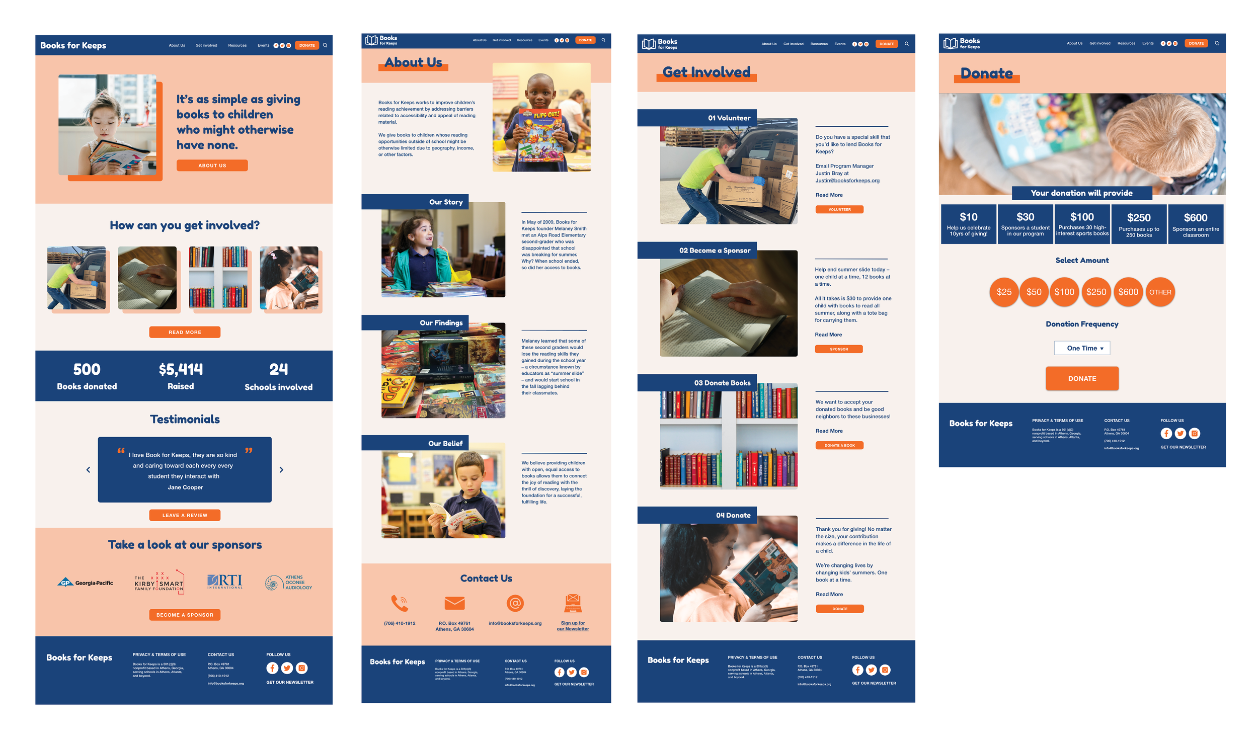
High Fidelity Responsive Wireframes:
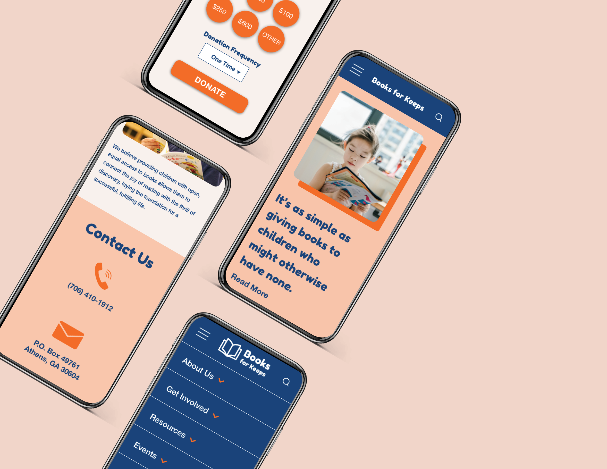
Features include: eye-catching button color, strong imagery, social icons on header and footer navigation
Visual System
After some research into color psychology, we decided to use a bright orange color for our buttons. Orange is found to be inviting, warm and enthusiastic. The primary typeface we chose, “Fredoka One,” is a large and striking font that evokes a playfulness similar to children’s books.
User Testing & Outcomes
Button Color
To keep with our style guide, we switched the round buttons to the orange color to indicate that they are clickable. We also changed the layout of the primary header to match the other pages.
Carousel Format
Based on user feedback, under the involvement section of the mobile homepage, we changed the images to a carousel format to save room and reduce the amount of scrolling for the user.
Conclusion
What’s Next:
Add in an events page
Create a search function
Establish a newsletter signup
Present redesign to Books for Keeps team
Takeaways:
Talking to someone from the company or organization helps to highlight and understand the client needs and target users.
Mutual project management and an open mind are crucial if you want to work in a group successfully.


